If you’re looking to spruce up your home in time for Spring, you’re in luck. We’ve done the hard work for you by matching up this year’s trendiest colours with Farrow & Ball’s luxury paint shades. It’s as easy as finding your vibe, magazine quiz style, and discovering the dream colour your home is missing. Read on to find the shade that works best for you!
Trend: Serene Escape
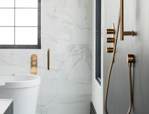
Life has been hectic and stressful the past two years, to say the least. If you find yourself feeling burnt out, making your home a sanctuary can help you to relax and de-stress. Infuse your space with that zen, post-meditation feeling by incorporating a serene colour palette – 2022’s most relaxing design trend.
For a soothing refresh, try Farrow & Ball’s California Collection: Hazy. This shade of blue reflects everything that’s trending in terms of design: it’s soft, subtle and juust neutral enough. This cold, Pacific-ocean-esque colour would look particularly dreamy in your bathroom, lulling you into a state of deep relaxation while you soak in the tub or do your nightly skincare routine.
Trend: Evergreen, Forever
If you gravitate towards classic colours, structures and silhouettes in your home (and you roll your eyes at the wave of ultra-mod celebrity homes gracing the internet), look no further than 2022’s most timeless trend, the evergreen colour palette. Literally and classically evergreen (see what we did there?), these trendy forest tones bring the outdoors in, creating a naturally calming atmosphere.
We recommend Farrow & Ball’s Green Ground – with its moss-y, muted hue, it’s guaranteed to bring the outdoors in. It reminds us of a tranquil outdoor spa, but if your home is missing one of those, it would look fabulous in your walkway, as you transition from the outside world to your newly-refreshed sanctuary.
Trend: Easy Breezy
If you don’t have strong opinions regarding your home’s colour palette (i.e. you can’t tell the difference between “eggshell” and “ecru), a low maintenance, guaranteed-to-look-good-with-all-of-your-stuff paint shade is for you. We recommend 2022’s take on neutrals – out with the boring (the washed-out greys, the sad, stark whites) – and in with the soothing (cool-undertones, silvery-greens).
To achieve this easy, breezy sense of chill in your space, try Farrow & Ball’s Pale Powder. This not-quite-grey, not-quite-green shade is perfectly versatile – an ideal shade for your living room, it will only enhance your colour palette rather than clashing with it.
Looking to refresh your space with one of the year’s hottest design trends? t2h offers an extensive selection of high-quality products that are trendy and timeless. To explore the range of options that t2h can provide for your home’s upgrade, visit us in-store at our Vaughan or Etobicoke locations to speak with a Brand Ambassador or book a virtual consultation on TUBS 360.